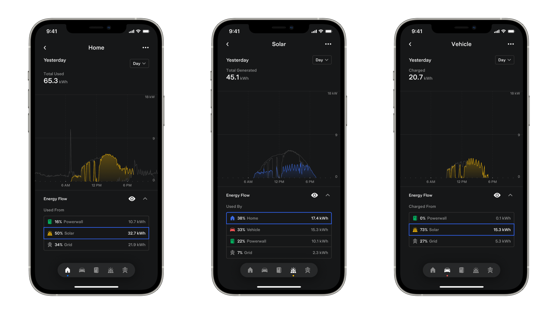
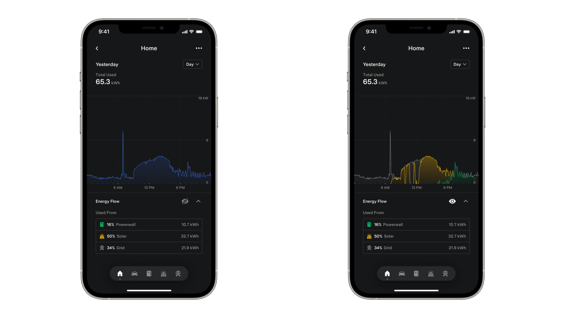
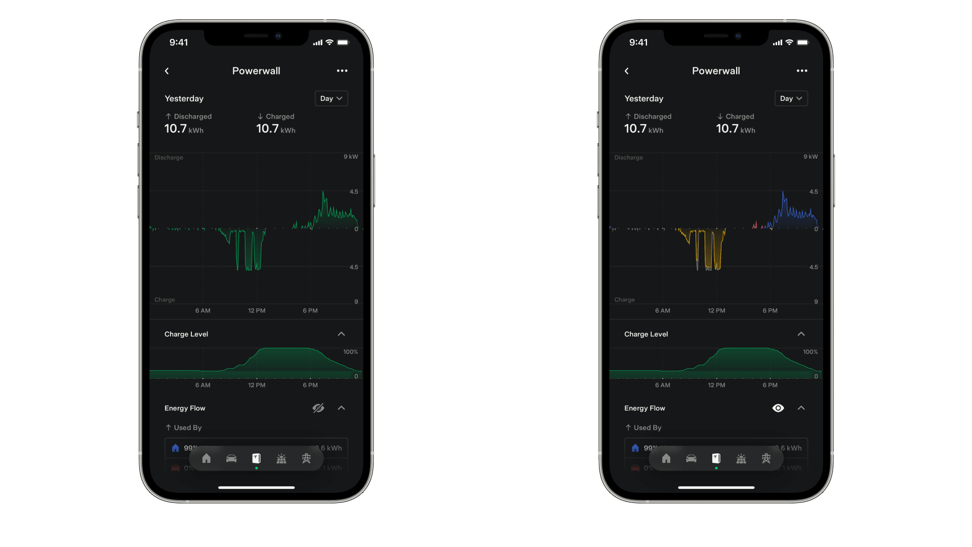
The graphs let you review all your system’s historical data at any time, right at your fingertips.
You can view data by day, month, year or lifetime. Use the timescale selector on the top right corner — it defaults to Day — to switch between these views. On the Day view, the energy graph will display stacked area charts with timestamps of the power data. The Month, Year and Lifetime views use bar charts to visualize total energy.
Swipe sideways along the middle of the screen to go back and forth between time periods.
You can also access and review data from a specific day, month or year in the past. Open the timescale selector and tap ‘Choose Date.’ To return back to the most recent data available, open the timescale selector and tap ‘Go to Today.’
Scrubbing
Tap and hold on the graph view to scrub and review data from specific timestamps. For example, you can scrub and see that your solar generated a peak power of 6kW at noon, or that your home was using 3kW of energy from solar production at the start of Peak with Time-Based Control.
If you have Energy Flow enabled, the scrubber shows the power values of each component at that timestamp, plus an aggregate total.
In the Powerwall component, the Charge Level graph will also display the charge level during each timestamp you scrub over.